I believe in creating designs that leave a lasting impact—something that feels natural, timeless, and effortlessly elegant. With Qtoniq, my vision was to embrace minimalism and make quotes the true hero. Every design choice was intentional, from limiting typography and colors to reducing distractions, ensuring a clean and immersive experience. The goal was to craft an app that feels light, sophisticated, and as minimal as possible while still being visually engaging. Qtoniq is all about simplicity with meaning—where less truly becomes more.
Logo Design
A great logo effectively conveys the right message about a company and its core functionality. For this project, my goal was to design a clean and straightforward logo, avoiding complex curves or shadows. After brainstorming and sketching numerous ideas on paper, I finalized a design that was both simple and intuitive. Since my focus was on showcasing quality quotes, I incorporated the letter "Q" within quotation marks, with a closing quotation mark positioned at the bottom right.
It represents Quality Quotes.
Here’s how the final logo appears on different backgrounds.
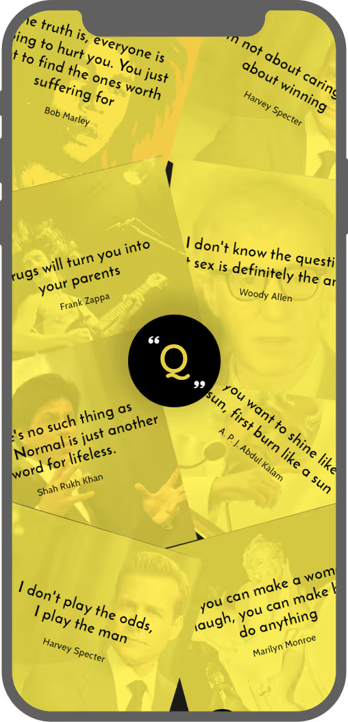
Typography
To keep the interface clean and free of distractions, I chose a color palette consisting of just four colors. For the quotes, I opted for Josefin Sans to provide an elegant and luxurious touch, while I selected Cabin for the remaining text to ensure high legibility and readability even at a small size.
Competitive Research
At this stage, I began researching our competitors by exploring similar applications on the Play Store. I discovered a wide range of apps offering the same functionality we aimed to provide. To narrow the focus, I filtered the apps based on download counts and analyzed them in terms of their UX and UI. Following a thorough analysis, I identified several key insights that required immediate attention:
- An overwhelming amount of content with little emphasis on quality.
- Subpar user experience
- Advertisements were poorly placed and lacked strategic positioning.
These issues resulted in decreased retention rate, more uninstalls and an unhappy user base.
The Problem
One thing became clear after the competitive analysis: there is a significant demand for an app that can motivate, inspire, and entertain people with quality content. However, the problem with existing apps was—
A lack of good user experience and quality content.
Ideation
By this point, I had a clear understanding of the problem we aimed to solve. I then began brainstorming and discussing various potential solutions. Some of the key points that emerged from these sessions were:
- Content is king. Focus on quality rather than quantity. Users tend to stick with apps that offer high-quality content.
"Build a database of top-notch quotes and lines from famous personalities, movies, and TV shows." - Users don't want everything on the screen; they come to read inspiring quotes. Overloading them with too many options leads to a lower retention rate.
"Design a simple, yet elegant interface that pops by itself." - Advertisements can be annoying, no matter where they appear in an app. However, they are essential for generating revenue and keeping the app sustainable. The challenge was to integrate them without disrupting the user's experience.
"Incorporate advertisements into the design in a way that doesn't distract the users.
Designs
With the points mentioned above in mind, I began working on the designs. I held several design studio sessions with the team and sketched various ideas on paper. After numerous iterations, I decided on a clean card view that would take up most of the mobile screen space, displaying one quote at a time. This design choice was intended to help users maintain focus on the content.
Traditionally, to read a quote, users would need to select a specific author or tag from the navigation, which would display all related quotes. They would then have to swipe right/left or top/bottom to view different quotes. To change the selection, users would need to repeat the same process. To reduce this friction, we introduced a spinner feature, allowing users to view random quotes with a single click.
Once all the screens were finalized on paper, we converted them into high-fidelity wireframes. Here are some of them: