
About the project
The Concept Library is a free reference for people who make software: designers, product managers, engineers and founders. Each entry explains one concept: what it is, why it matters, how to use it, what it gets confused with, and where the idea came from. I designed it, built it, and set up the system that writes and checks every article.
 Side Gig
 AI First
- Project Scope
- Product Design, Design System, Build
- Business Model
- B2C
- Timeline
- 5 weeks
- Live at
- theconceptlibrary.com
I wanted it to feel playful, cool enough that you'd send a page to a friend, but calm enough to sit and read. So the play lives in the details and the reading stays quiet: a white page and ink type, with colour kept to the cards.
I gave every corner the same care as the home page. The 404 is a poster whose last 4 has tipped off a shelf. An error page snaps BROKEN in two. Book spines slide out when you hover, buttons squish when you press them, and the opening animation plays once per visit, then gets out of your way.
Design direction
Learning should be fun
Most glossaries look like documentation: grey text, a search box and a long list. People skim them and forget what they read. I wanted learning here to feel like play, so the whole design language borrows from the things people already learn with: posters, bookshelves, flash cards, flip books and quizzes.
People learn more from something they enjoy coming back to. Flipping a page, turning over a card or answering a quiz turns reading into something you do, with small moments of delight along the way. That engagement is what helps people understand a concept and remember it.
1 · See it
A picture for every idea
Each concept gets its own illustration, so there is an image to remember it by, not only a sentence
2 · Pick it up
Objects, not rows
Poster cards and book spines make 1,280 concepts feel like things on a wall or a shelf you can take down
3 · Try it
Flips, cards and a quiz
Every written concept can be read three more ways, each one something to play with, not just text to read
Fun needs a limit, or it turns into noise. One rule held it: one bright colour per card, never a coloured page. The page stays white, every card is cream with an ink border, and each one gets a single colour from a five-colour poster set.
A wall of posters
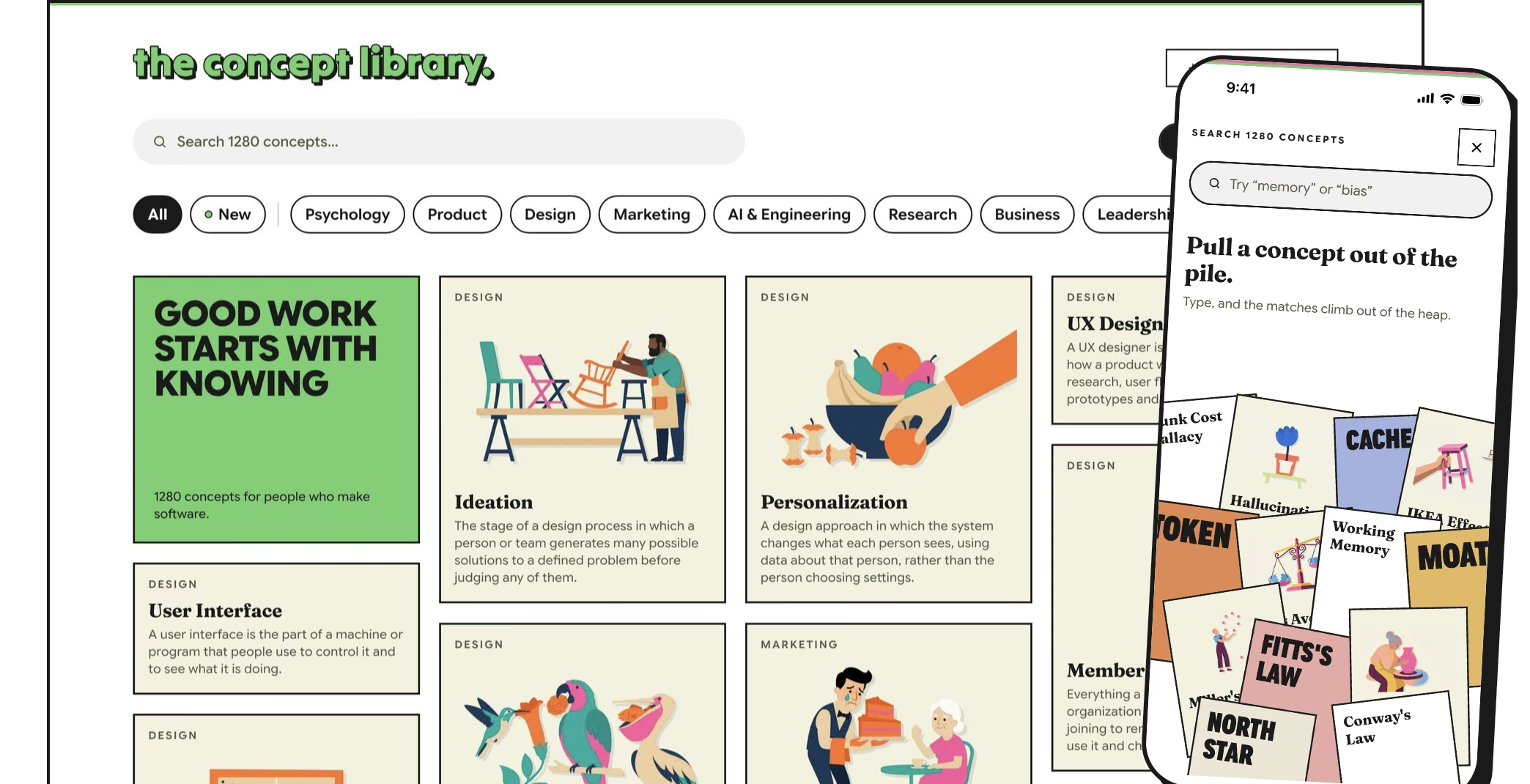
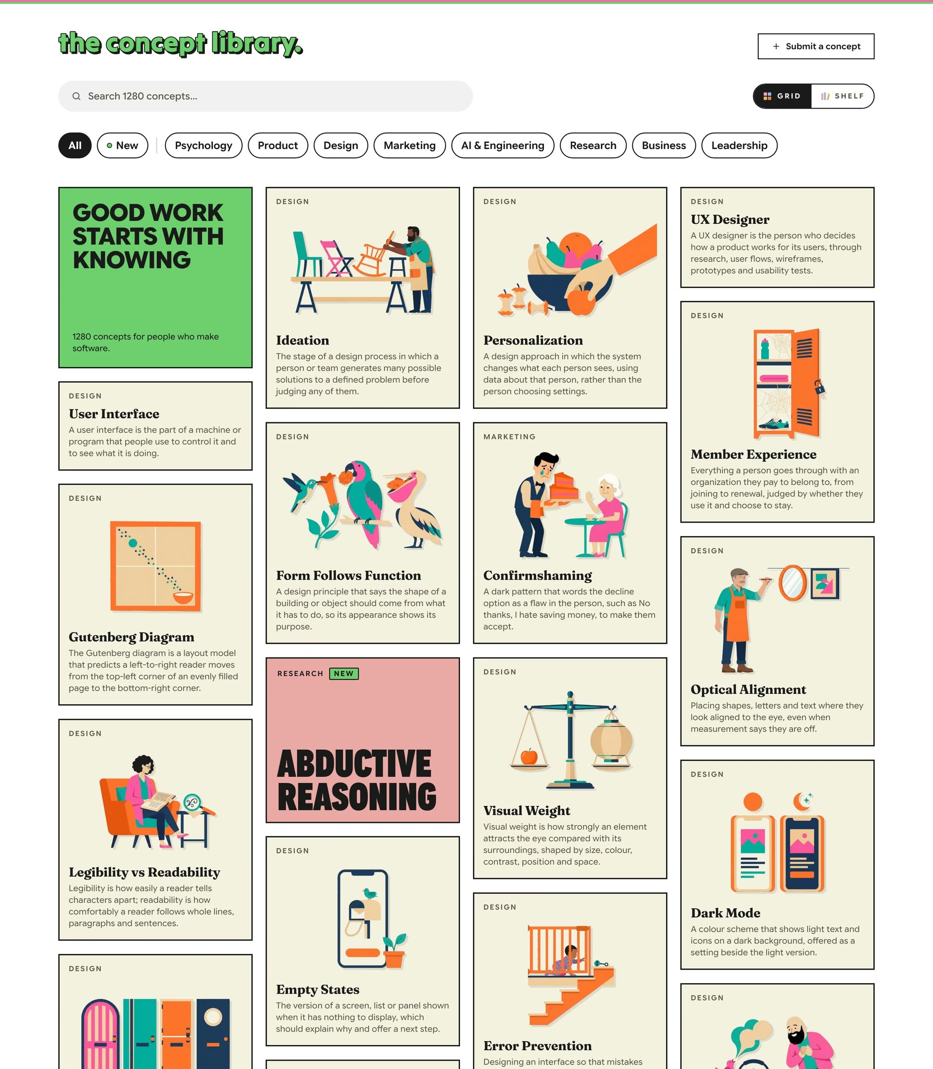
The home page is a masonry wall of poster cards: the illustration first, then the title and a one-line definition. Category chips filter the wall, and a green dot marks what was added in the last two writing days.
A long run of illustrated cards turns monotonous, so I break it on purpose. About one card in every ten drops the picture and sets its title in big poster lettering on a coloured ground, like Abductive Reasoning in the middle of the wall. It's a layout rule, not a fallback for missing art: when no un-illustrated concept is left to fill the slot, an illustrated one is promoted to type, so the break never fades as covers ship.
The way in
A first visit opens on the wall's own first cards. They run round the screen like the game Snake, slow down and fold into their slots, and the full stop drops onto the wordmark last. It plays once per visit, any tap or scroll skips it, and with reduced motion on it's a short fade instead.
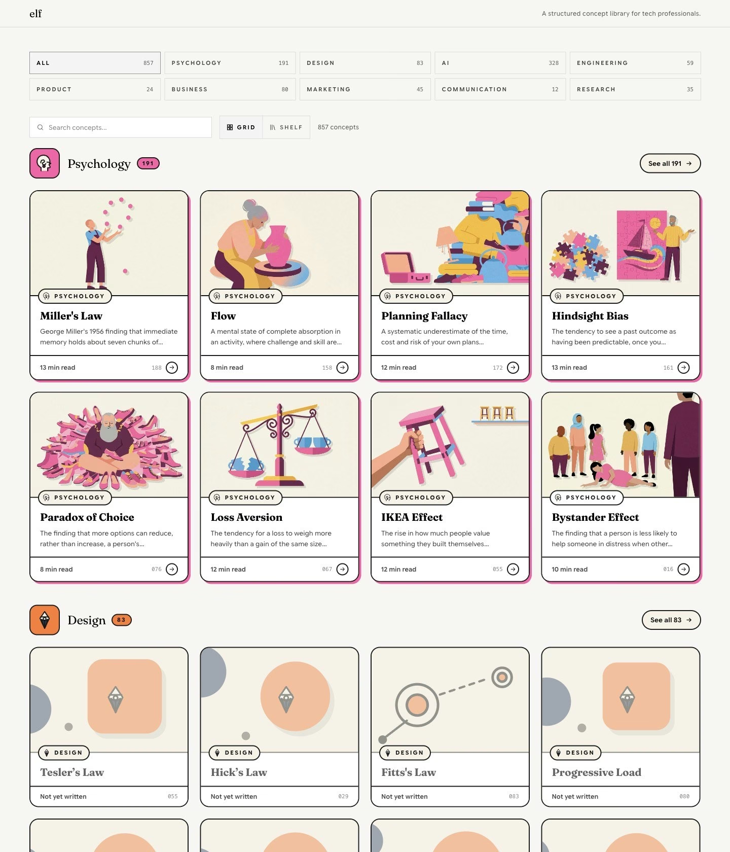
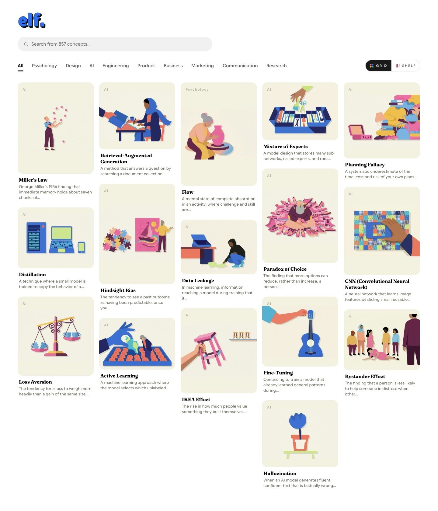
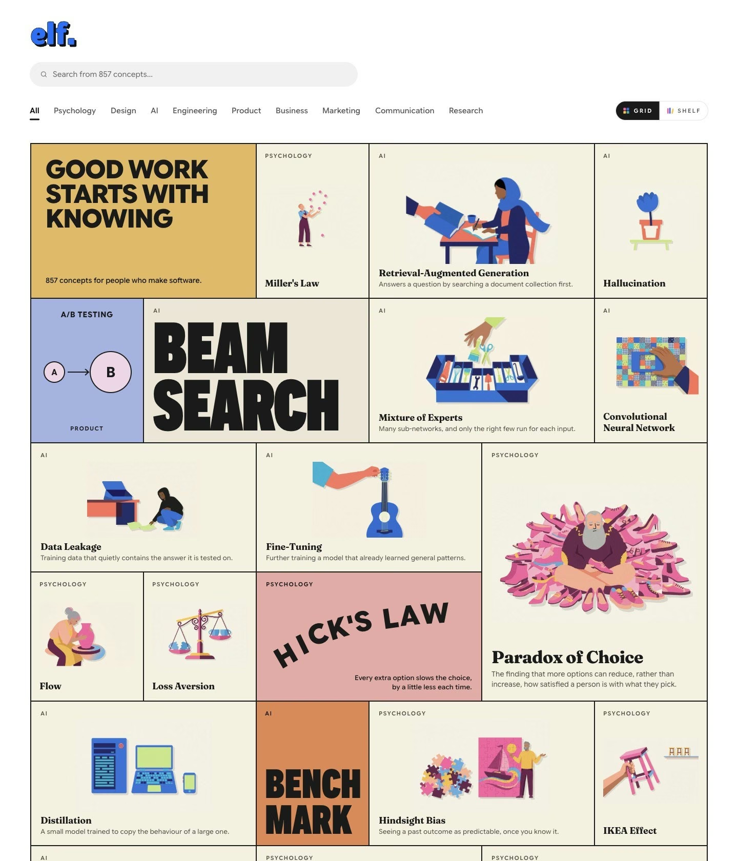
How the wall got here
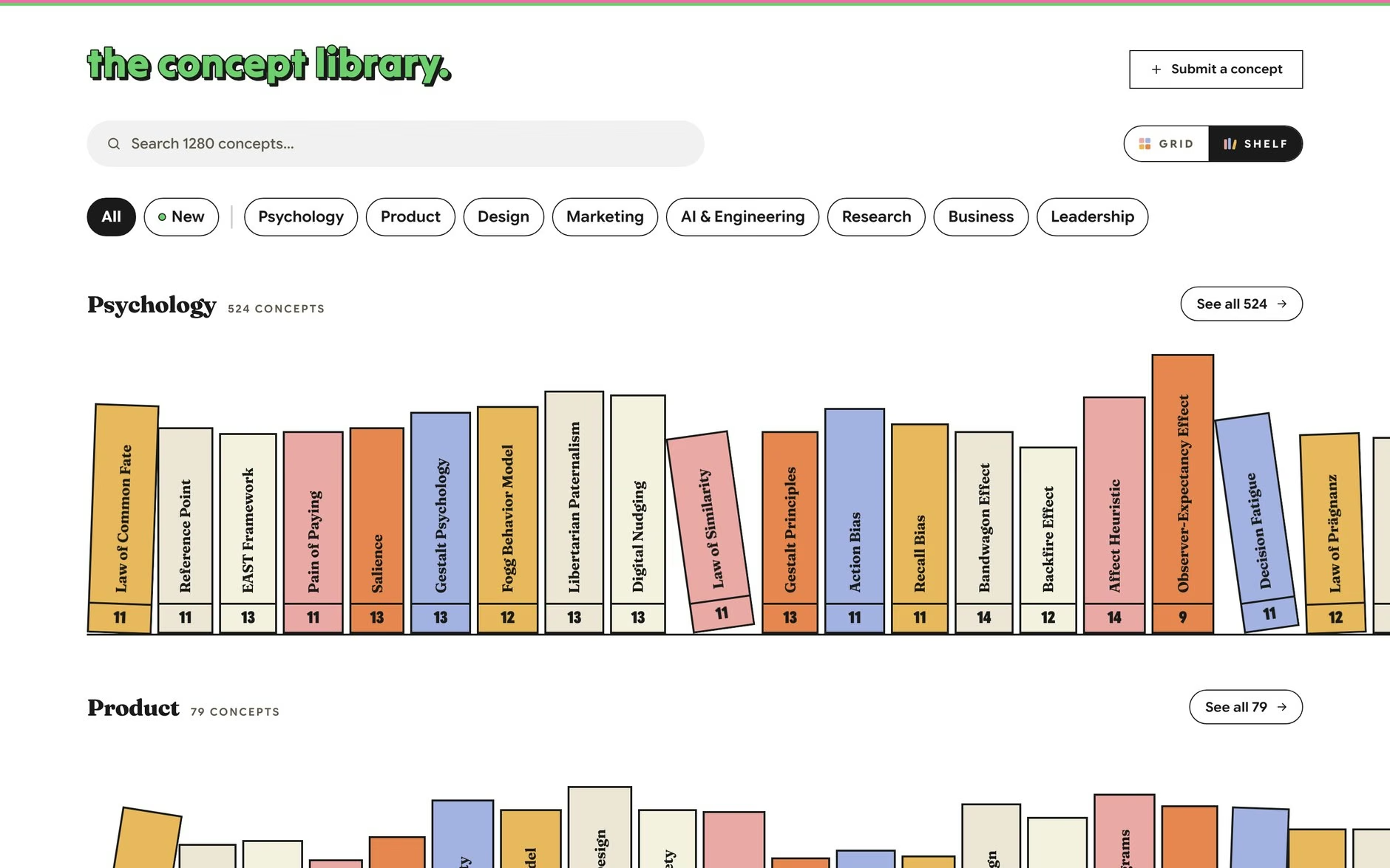
Or take one off the shelf
The grid is for scanning. The Shelf is for wandering: the same library as rows of book spines, one shelf per category, each spine carrying a concept's name in the poster colours. It turns a list of 1,280 entries into a room you can browse.
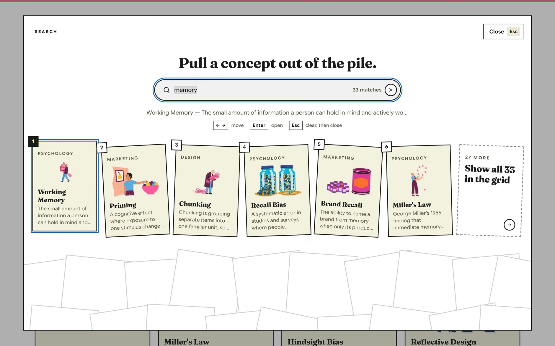
Search is a pile of cards
Search doesn't return a list. It pulls the matching cards out of a pile and lays them in a row you can step through with the arrow keys. When nothing matches, the empty state asks you to submit the concept instead of leaving you at a dead end.
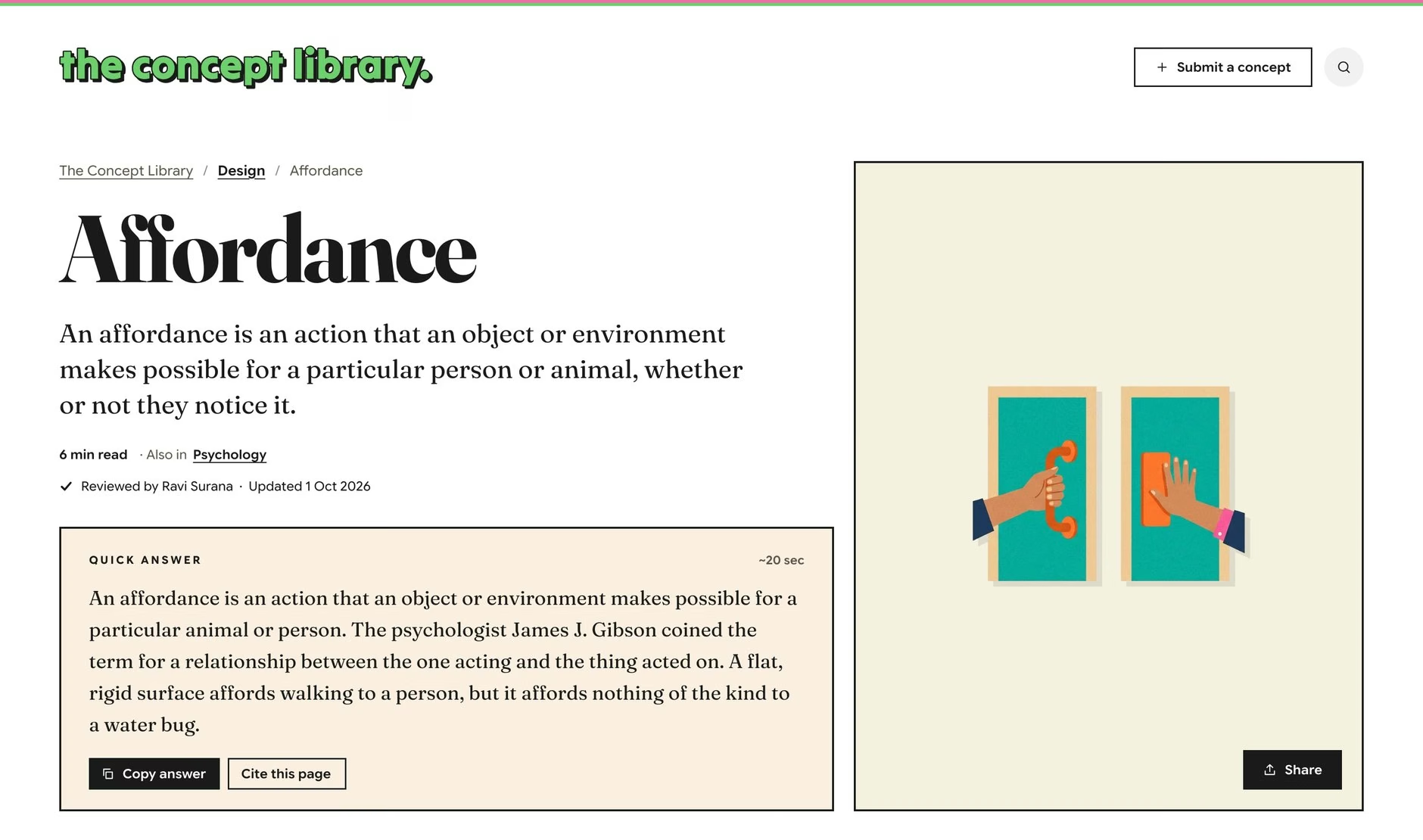
The concept page
Every page answers first and explains second. A quick answer of about 50 words sits at the top, with a copy button and a ready-made citation, for the reader who only needs one sentence they can use. Everything below it is for the reader who stays.
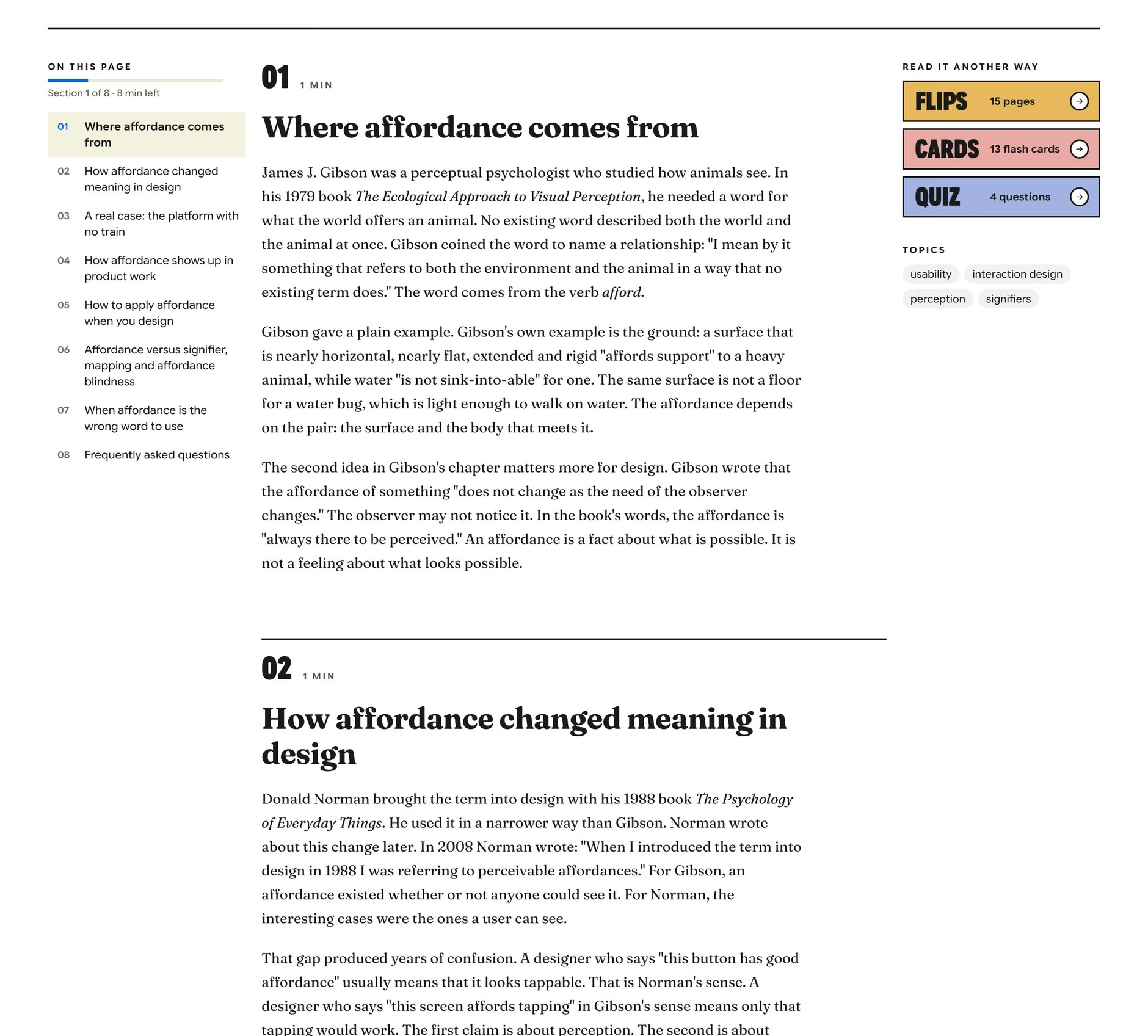
The article is split into short numbered sections, each with its reading time, and a contents rail tracks where you are and how many minutes are left. On the right, three buttons offer the same concept read another way.
Read it another way
This is where the design direction pays off. Beside every written article sit three other ways to take it in, each in its own poster colour and each fully usable from the keyboard.
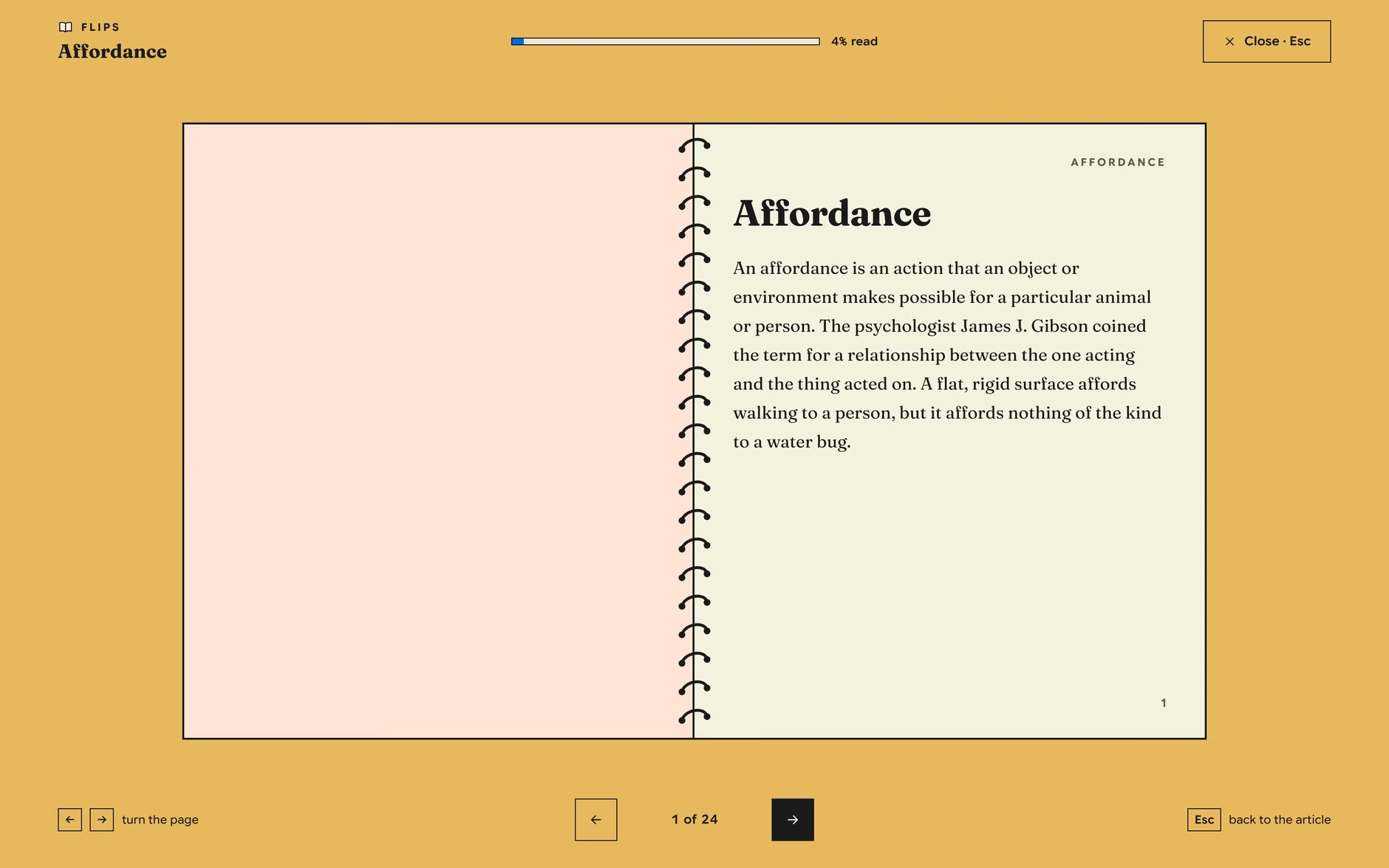
Flips
The article as a spiral-bound flip book, one idea per page. Small pages slow you down just enough to take each point in.
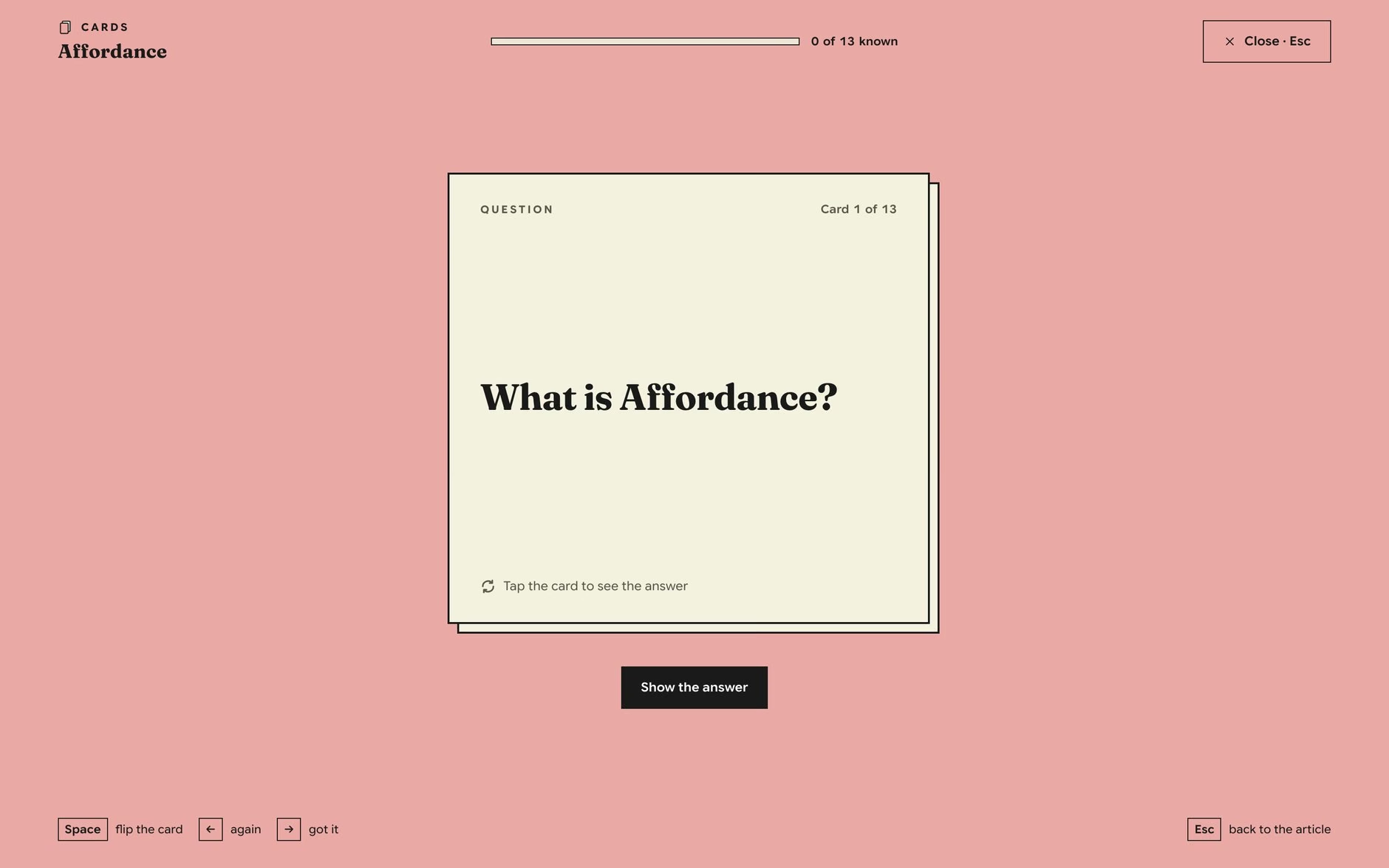
Cards
Flash cards with a question on the front and the answer on the back. You mark each one "again" or "got it", and a bar counts how many you know, which turns a definition into a small game you can win.
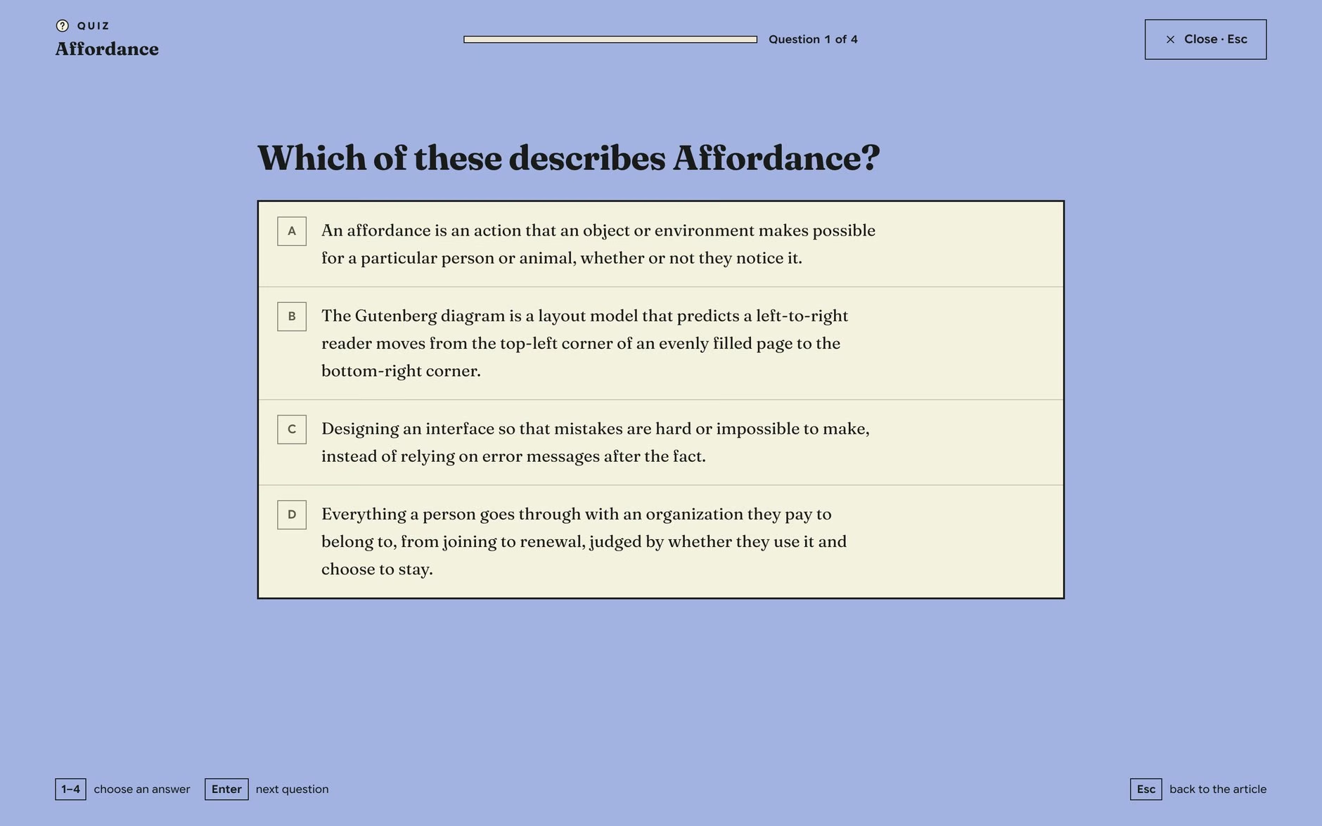
Quiz
A short multiple-choice check at the end. Every option is a real definition from somewhere in the library, so even a wrong pick shows you another concept, and the number keys and Enter keep it moving fast.
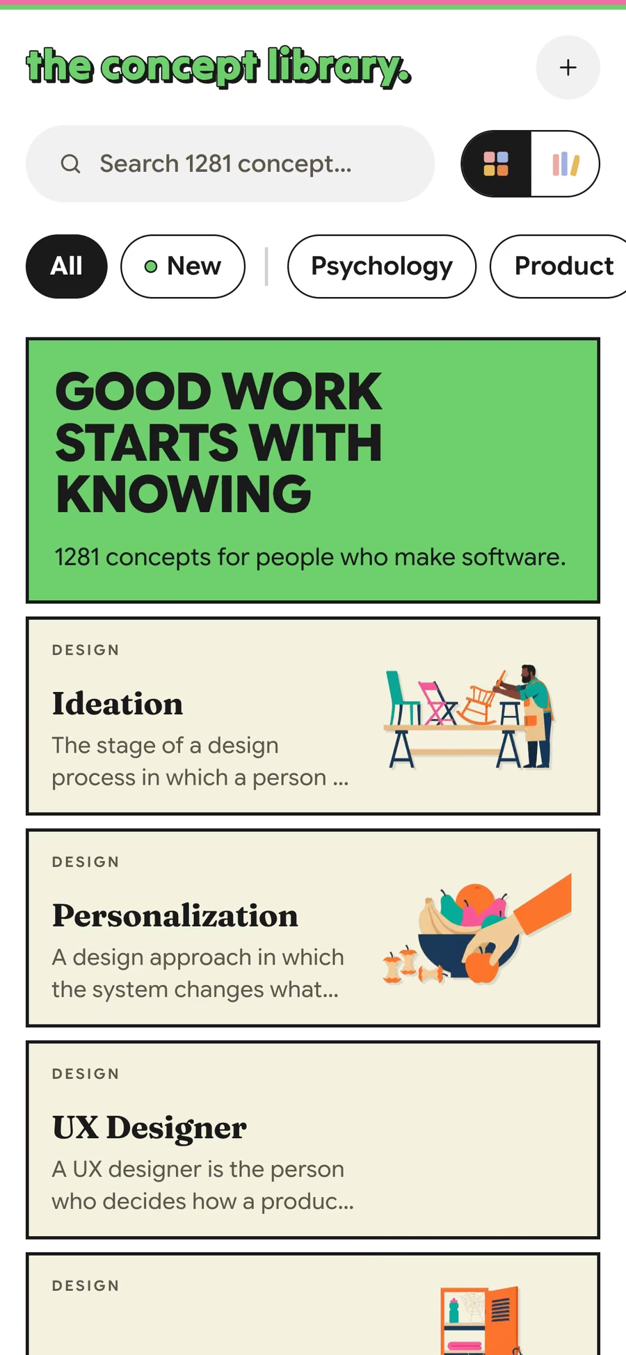
Just as playful on a phone
The phone gets its own layouts, not a shrunk desktop. The wall becomes a single column of rows, and the concept page is built separately for small screens.
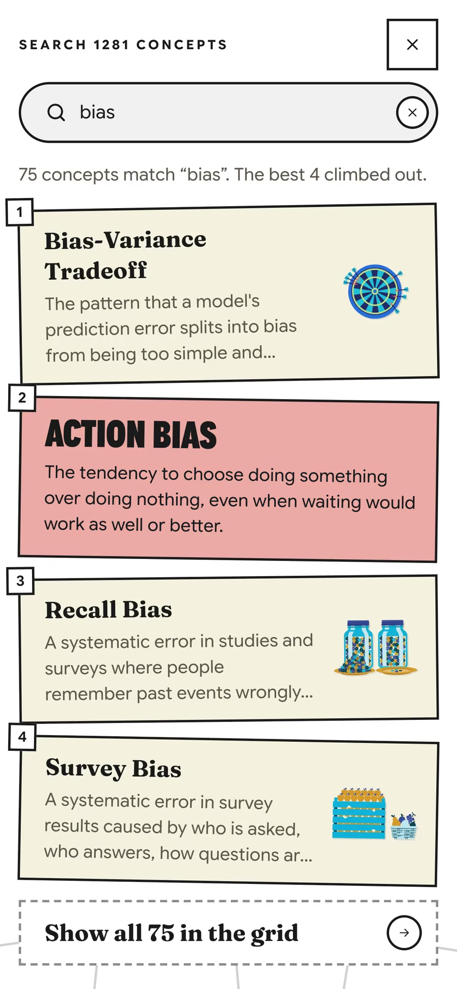
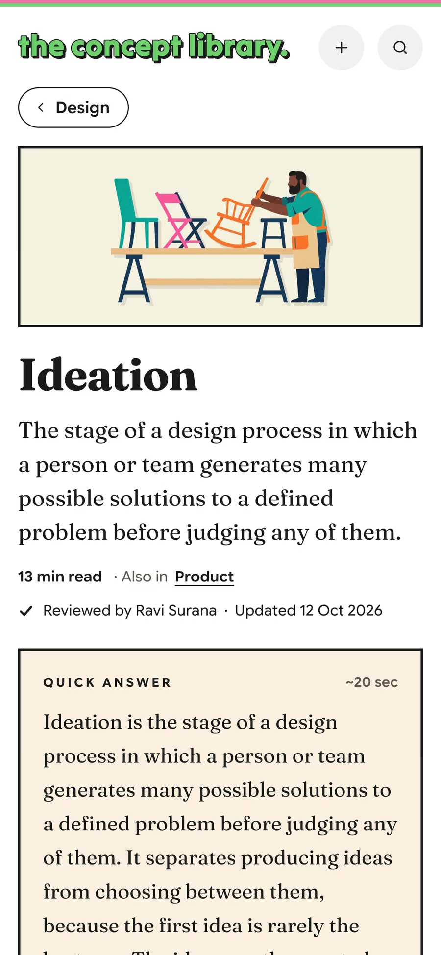
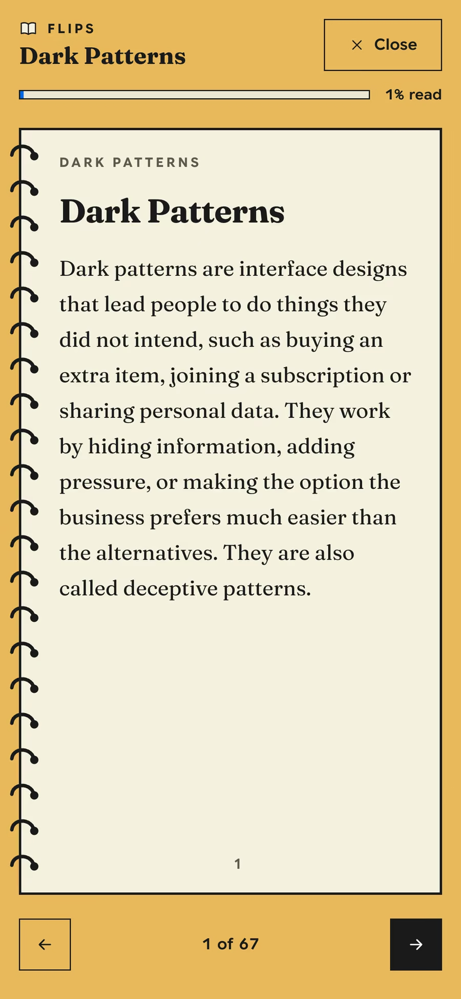
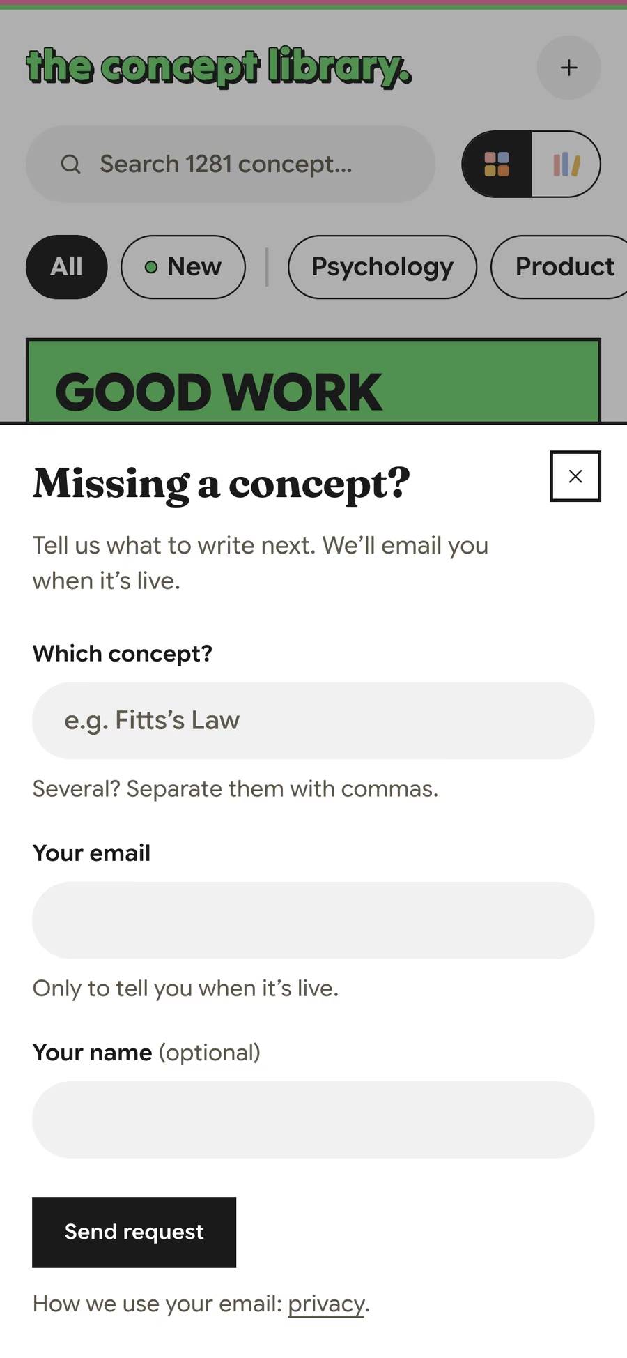
A system that keeps it playful, not messy
A playful look falls apart fast when every page adds its own colour. So the fun lives inside a strict system, designed in Paper and mirrored in code:
- Two type families with separate jobs: a serif for anything you read, a sans for anything you press. The tall poster lettering is the same sans squeezed to its narrowest width, not a third font.
- Every colour, size and space is a token. A design check runs on every change and fails when code uses a raw value; any exception has to be written down where it happens, so drift never slips in silently.
- I cut the type scale from 66 text styles in Paper to 26.
- One illustration style for all 334 covers: flat vector, no outlines, a hard offset shadow, one hero colour per category and never any text in the picture.
- Each component has its own written spec, so anyone building a new page, person or agent, reads the rules before adding to it.
The content system
1,280 concepts are too many to write one at a time, so articles are drafted with AI help. My part was the workflow around it: seven steps every new article now goes through.
Pick five a day
 Notion
 Jev
Jev Claude
Five concepts a day, each from a different category. Jev, a separate AI, ranks what's left by how important each one is and how often people search for it. Pages that other articles already link to jump the queue.
Read what already ranks
- Claude
Up to 15 top search results on the concept get read first. The article covers what they cover, then adds at least 30% more: how it really works, real cases, common misreadings, and where it breaks down.
Write to a shape
- Claude
Every article opens with a short answer that stands on its own, then follows its category's template, with an FAQ and a numbered source list. Each claim it leans on is paired with the exact sentence from its source.
Jev checks it
- Jev
 GitHub
Jev reads every new draft and asks: right concept? Is each link really the study it names? Does each source say what the article claims? The writer can't publish its own work. Only the check can.
I review it
Jev isn't the last word. I review every article myself, by hand.
Live, or back to the start
- Notion
 Vercel
A draft that passes goes live with the next daily update. One that fails is rewritten from scratch, not published with a note attached. Two failed rewrites and it waits for me. Borderline calls go live, flagged for a second look.
Draw the cover
 Paper
Paper- Claude
- Jev
Each article comes with a one-line description of its cover, and Jev checks it fits the concept. I then make the illustrations in batches in Paper with Claude, and approve each batch before it goes live.
Testing the checks before trusting them
The old checks only tested format: right length, right headings. Nothing confirmed an article explained the right idea. So before switching Jev on, I ran it against 99 articles with known answers. It flagged 40 of the 41 that explained the wrong concept, and rejected 121 of 128 citations that had been swapped to point at the wrong study.
Where it stands
The Concept Library went live in October and grows by up to five written concepts a day. Every concept already has a page; the written ones carry the full article, its sources and the reading modes.
1,280
Concepts listed
331+ written in full so far, across eight categories from psychology to AI
331
Written and live
Full articles, each with a quick answer and its sources
334
Illustrated covers
In one style, with one hero colour per category
5 weeks
Of focused build
The design system, the content system and the launch, built on an earlier prototype
It has no audience numbers yet, and I haven't tested it with users. Next I want to learn whether Cards and Quiz really help people remember a concept a week later, and to answer the hardest product question: why open a library instead of asking a chatbot?